If you look in any of the key fashion magazines at the moment you will see… a plethora of studio images shot with a grey background. It’s these images that are creating buying decisions in the retail market place and it makes good sense to cash in on the demand they are making for this kind of photograph. Essentially grey is in fashion right now.
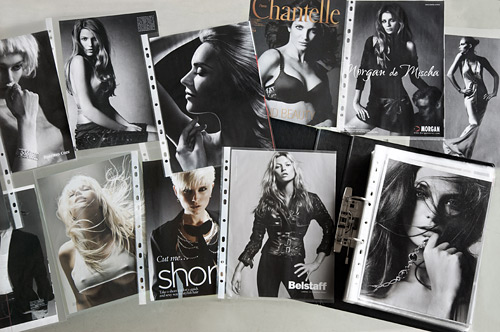
This is my ‘look book’ with a few of the 200 pages removed and spread out to show some of the grey background images I’ve collected from magazines like Vogue, Harpers and Elle. I have a good collection of location pictures too, taken using natural light and some with flash. I use these tear sheets as ideas for pictures and I often combine the mood of one picture with the lighting style of another. These sheets slot into the rear pocket of my Billingham bag and I regularly have some to hand on a shoot.
When I use my look book for ideas I always start by dissecting each image to understand how it is lit, paying special attention to the hardness and direction of the lighting sources. One of the most challenging things to work out is how far a light is from the subject. A distant soft light and a near harder light can produce a similar shadow gradation from umbra to penumbra. The trick is to look at the fall off of in intensity. A light nearer the subject will be noticeably ‘intimate’.
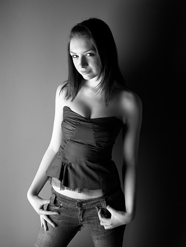
This is a one light shot, this time I used a 6’ x 4’ Bowens wafer softbox low down to create this striking portrait of Jade, one of my clients. Where possible I like to keep lighting simple. The background here is a grey painted wall. Getting a good grey paint is important and the best I’ve found is the ‘Ice Storm’ range from Dulux professional. Ice Storm 1 to Ice Storm 6 goes from black to near white with 5 steps in between, so it’s easy to get the right shade for your taste. Hasselblad H2 with Phase One P 25 back, ISO 100, f/19, 1/125th,80mm f/2.8 lens.
Dark walls…
In the real world light rattles around rooms. Even if there is only one window on one wall of a room the light in the room comes from all angles as it gets reflected around. A white or light room will give the most fill light to key light ratio. To recreate the same effect in the studio with a single softbox we need to use big reflectors, white painted panels or have white painted walls.
I’ve never had a white walled studio because it is difficult to get clean crisp deep shadows when light is bouncing off just about every surface, and shadows are what we need to define shapes in photographs. With white painted walls, the only way to reduce the reflections and strengthen shadows is to use negative reflectors (matte black).
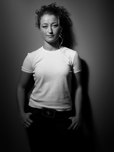
This one light shot I took of Elizabeth as part of her 21st birthday shoot used a beauty dish with a central honeycomb grid. I used the light in quite close and this resulted in an f/32 lens setting on my Hasselblad. It’s a mixture of hard light and soft light from one light unit. I should have knocked the light power down a couple of stops perhaps to get optimum optical quality but the Hasselblad primes are naturally sharp and can cope with these extreme apertures. Hasselblad H2 with Phase One P 25 back, ISO 100, f/32, 1/125th,80mm f/2.8 lens.
An ideal photographic studio is a black box and any light that is introduced is under our control, even in a daylight studio we need to have window blinds that allow us total control of the light. My system for setting up studio lights is to set up one light at a time switching off all the others while it is being set. Once the direction and hardness quality of each light is set I will then switch them all on and adjust the lighting balance using the power controls on each head. The final stage is to control the contrast in the key areas of the picture with reflectors as necessary.
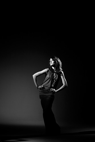
This shot was taken in a huge, nearly white studio with an infinity cove. Although the studio looked white, it was in fact TV white which is really ‘dove grey’ in paint colour lingo. I used just hard light from three Broncolor Pulso heads fitted with standard reflectors and fine honeycomb grids. Hard light strikes less of the background and therefore less light is reflected, this together with an increased working distance from the background meant that I was able to create a true black on the near white walls. Canon 5D, ISO 100, f/11, 1/125th, 70 - 200mm IS f/2.8 lens at 105mm.
My own studio is usually f/16 at ISO 100 with my monoblocks set to quarter power. This is just a starting point for my camera settings and once the lighting balance is right, I only need to adjust the lens aperture from then on to give me the correct exposure. I never use a light meter as it doesn’t know how moody I want the shot to look, so I always use the camera screen to asses exposure.
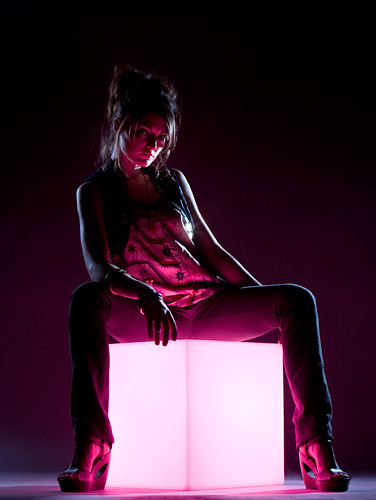
This is the first picture in this set that I’ve chosen to introduced a prop. The white perspex cube is a side table that I bought online. I’ve cut a hole in the back and inserted my Mobil flash head with a purple gel taped to the front. I’ve used two other flash units fitted with honeycomb grids to provide kick lights. Canon 5D, ISO 100, f/14, 1/125th 70 - 200mm f/2.8 IS L lens at 80mm.
In order to accurately asses exposure in camera I use a closed loop system to set the screen brightness. I take a jpeg of an average scene like my house and garden. I download it to the computer, and open it directly in Photoshop. I don’t use RAW, a jpeg is best for this. I then put the memory card back in the camera. I press play on the camera and view the same picture on both screens side by side. I then adjust the LCD brightness of the camera using the menu system and set it to a value that gives me the best match of highlight and shadow tones on both screens. This does rely on my computer screen having been correctly calibrated using my i1 calibrator first. The result is that pictures I shoot in the studio give me no surprises when I bring them into Lightroom.
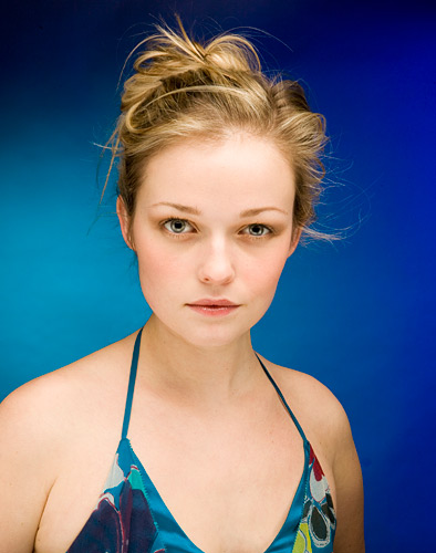
This picture was lit with an overhead softbox directed straight down and a tri-flector from underneath lifting the shadows under the chin. The background grey paper was lit with two flash heads fitted with standard reflectors and blue and cyan gels. I chose these colours to match the dress. Canon 5D, ISO 200, f/22, 1/125th, 70mm lens
A really useful addition to the grey background arsenal is the ability to use coloured gels and get really saturated results. When you put coloured light onto a white background the resulting shots have a pastel quality to them. Even if you under light or under expose for the background, the images can still look washed out and dull. On the other hand with a neutral grey as a base for coloured light the results are particularly vibrant. Gels cost under £5 for a large sheet and this is a fraction of the cost of having to stock a range of different paper colours. It’s easy to create colour gradients with gels too.
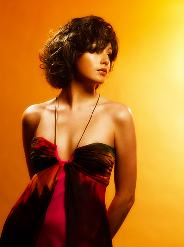
This shot was taken for a hair salon against a grey background roll that is lit with orange and yellow gelled lights. There were two lights on the background and a high backlight from behind the model and finally a key light provided by a beauty dish from the right of camera. The low viewpoint and the hard key light provided the drama while the soft diffusion applied by Marko in post production gave the models skin a baby oil look. Hasselblad H2, Phase One back ISO 100, f/16, 1/125th, 80mm lens.
If you want a day learning how to be creative with light why not join me on my next studio lighting workshop on the 7th May. See here for details.

Hi Damien
Your pictures are masterpieces- I keep checking in on them whenever I need inspiration :)
About the background- do you only use grey + gels? What do you do when you’d like to include parts of the floor in the shot? (I would think in that case colored paper-roll is necessary?) Which brand do you recommend?
Thank you for sharing all this great info,
Nathalie
Hi Nathalie,
Thank you for all your compliments. I use background rolls by Lastolite or Calumet for all my full length shots. The first and last shots of this post show a paper background, other full length shots show vinyl flooring pieces.
Kind regards,
Damien.
brilliant info as ever Damien, saving like mad to get on one of your photoshoot days, on the subject of gels, do they fasten on to any lights and in any particular way, as am planning on buying the vivid collection, I photograph children in nurseries and a grey background with a set of gels sounds like a must buy, also would you recommend a cloth background or paper ???
cheers David
Hi David,
We have the studio collection of gels that covers most needs except that of a disco perhaps. Our gels are 12″x12″ square and clip onto the rim of a studio light. Honl make gels for Speedlights but they are too small for big flash units. I’d avoid anything with the word vivid in it’s title unless you are lighting a disco or pop band;)
Cheers, Damien.
Thanks Damien
tried shooting F16 on a couple of portrait sittings last week and you have made me think!! been so used to working at F8/11
Neal
Hi Damien
really enjoy seeing your work – thanks so much for sharing,
I notice on these your shooting at F22 & F16 – just wondered why you dont shoot at F8 for portraits?
thanks
Neal
Hi Neal,
Studio work requires crisp sharpness front to back and is less forgiving by it’s nature. On location you can really open the lens up and all looks great. It’s only a convention based on what we are used to seeing. Regards, Damien.
Hello Damien, just a quick question.
Regarding the perspex cube, where did you get it from?
I have taken inspiration from your photo & plan to shoot a version myself.
All the best
Sheradon
Hi Bam,
Sorry for the delay in replying, I’ve had a bit of bother with a virus or 2 :(
If you stop light landing on the grey background it will be black. You will need to use hard lights to do this.
If you use a lot of softlight to light your subject and your subject to background distance is short then your background will be grey.
If you add light to just the background and you light it to a level of 3 stops above your subject the background will become white.
The choice is yours. I hope this helps.
Hi damien
I am looking to shoot with the calumet storm grey backdrop.
It is a commercial shoot….showing full length portraits
Will i have to light the background to keep it a light grey?
Cheers
Bam
Hi Damien
A great article, very informative, have just had a customer buy a grey backdrop based on this information.
Thank you
Mick
Hi David,
The grey background is from Calumet and is called Storm Grey.
I hope this helps :)
Damien.
Perfect!
Thanks, Damien.
Hi Damien,
I hope this e-mail finds you well.
Just a quick question on the studio day which I had the pleasure of attending. We also used a grey background, with FAB results – Thank you.
Can you pleae let me know what the background grey colour was called and from what supplier.
Cheers Damien, looking forward to seeing you at Focus 2009.
Dave
Damien,
Thank you for such straight, solid information. I had noticed the shift to grey but now I have to do it too !
Regards,
Jim
Hi Tanya,
I have a spare cube. It is not cheap but it has the necessary 16mm spigot and aperture in the bottom to take a flash gun. A Speedlight with a gel and a Sto-Fen will do the job and if you use a Pocket Wizard you wont have to Photoshop out the wire;-)
email me if you are interested in the cube.
Damien.
Hi Andrew,
Start with a vivid pack from here.
Damien.
Hi John,
Don’t buy two magazines the same month as the adverts will be the same. It’s the adverts that provide some of the best images. I alternate titles each month.
Damien.
Very inspiring, thank you! I need to track down a similar cube now!
Another great article, thanks Damien.
I’ve been looking at getting some gels just this week, but have been somewhat overwhelmed by the choices of colours (particularly blues). Which gel colours do you use most frequently?
Thanks,
Andrew
Hi, I’ve noticed that these are all plain, solid grey backgrounds – like a solid white background they appear to promote a higher degree of sophistication than the traditional mottled effect grey. Great article – thanks very much.
Damien. I know of no other photographer that would let up this info for free. You are an inspiration. Cheers! Best subscribe to Elle and Vogue without my mates knowing!