The following 5 photographs were commissioned for a charity art project that will be revealed soon. In the meantime I thought it worthwhile sharing the reasoning behind the narratives, composition and techniques that I used.
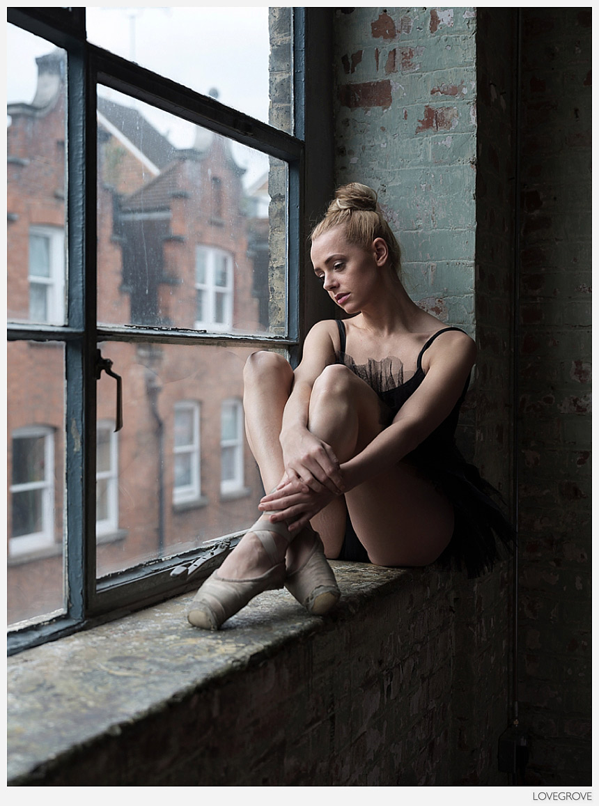
1. I love the simplicity yet complexity of this frame. It seems rudimentary enough. There is a lead into the frame from the bottom left past the well worn pointe shoes, however our eyes land on Ayla first because the contrast on her is higher than in any other part of the frame. I especially like the low contrast rendering of the houses on the other side of the street. The colour palette is calm and of complimentary reds and greens. The composition is on the thirds too. There is a compressed perspective from the 64mm focal length on the GFX camera yet there is a wider viewpoint to the one we are used to seeing with smaller format cameras. All these are supporting attributes to the central subject that is Ayla. What just happened? What’s going through her troubled mind? What does the future hold? These questions exist in the image because I set a narrative. I asked Ayla to put herself in the mind frame where she has just failed an audition. A big opportunity has just passed her by. Those thoughts covey a sense of regret and self disappointment. My first frame in this set was a little too poised and I asked Ayla to slump down a bit in a non dancer way. Taking the tension out of her shoulders was all it needed to deliver a believable disappointment. Sometimes there is more behind a photograph than meets the eye at first glance. I chose f/4 on the 32-64mm GF lens to render the houses across the street beautifully soft yet completely comprehendible and un distracting. ISO 100, 1/125th second on a tripod.
Incidentally, another project I have running in the background is a book called Tutu and a couple of these frames will make the cut for sure.
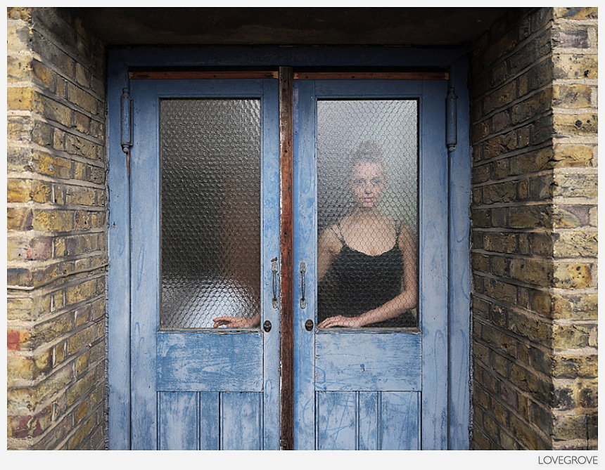
2. There is no such narrative in this shot. It’s just a ‘clever dickie’ photograph. I saw the potential, set up my tripod and camera, brought Ayla Rose into position and directed the placement of her hands including the finger tip touch. I went for symmetry in composition and I was lured by a calm duotone of the complimentary colours blue and yellow.
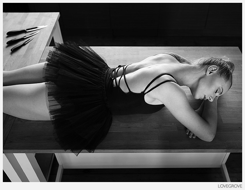
3. The journey to create this slightly creepy shot started when I noticed the light on Ayla’s back while she was standing in the kitchen area of the studio drinking tea. I am a fan of two point light and especially when it occurs without intervention like this. I know you are thinking; why the knives? Let me explain. This is an ‘art’ project and I was commissioned along with 11 other photographers to participate. I’ve been around art all my life and I’ve often been told that a piece of art has the power to change your emotional state. Timeline is the hook I had in mind when I put the elements in this photograph together. Here are some timeline key words that spring to my mind: #calm #serene #resting #beauty #unaware #innocent #oblivious #unsuspecting #impending #barbarity #ferocity #violence #climax #dying #death #still #calm. Make of it what you will. Fujifilm GFX50s, 32-64mm zoom, f/4.5, ⅓rd second, ISO 100 and my tripod extended to full height. I used the self timer to give me a chance to remove my shadow from the scene.
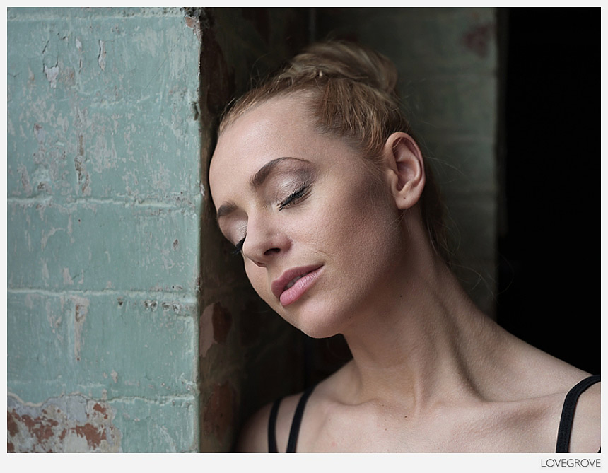
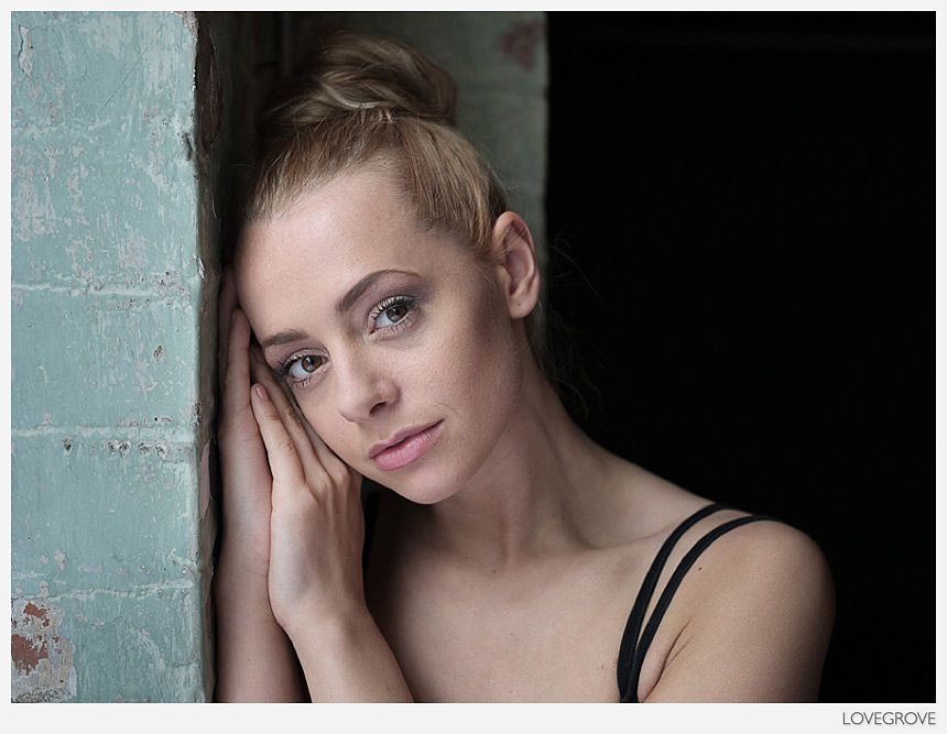
4. I shot a few close ups and chose this recess to place Ayla in. Light against dark is the key principal at work here. The composition is enhanced by the strong verticals intersected by the diagonals formed by Ayla’s eyes and her shoulder line. As there is no eye contact the viewer of the photograph is left wondering what Ayla is thinking.
5. I love this connection, the simple beauty and harmony. GFX50s, GF 32-64 lens at f/4.
I shot 19 frames of Ayla Rose in total from the start of the shoot to the end. That included test shots and mistakes too. I had the one frame I needed for this project by shot twelve and I decided to take a few extra beauty shots of Ayla Rose while I was there. Shooting this way with every frame counting and the camera on a tripod is like being on 120 film again and that is no bad thing.
I’m not going to give any more details away about this project but all will be revealed by Sean, the curator and Haçienda studio owner in due course. All proceeds from this project are going to Shelter From The Storm a homeless charity entirely funded by donations. All the profits from the Haçienda Studio in 2017 are going to the SFTS charity too. It’s a fabulous charity so it’s one good reason to book onto a studio shoot session; see here for details.
Please feel free to comment on these pictures below.
Did the book for this project ever get completed
Sadly not Shaun. My Tutu project is still on the cards though.
You are really a master of light and composition, your black and white narratives with lupo lux are masterful
Thank you :)
Loving the opening photo and also the second head shot. I was unsure when I first saw the one with the knives as I like the look (b/W) and the pose but was not sure about the knives. Having read your comment about why they are there it shows what do I know about art :)
Thank you Peter,
Don’t worry about understanding the arty b—ocks. Most of the time ‘nice’ is better.
Kind regards,
Damien.
P.s. additional remark: I found the first picture really very strong, you can see the melancholic mood and what you tried to achieve has worked very well. As photographer myself I always try to let my models show a certain mood of what I have in mind, and this is hard to get sometimes, but here it is wonderful. Great work Damien.
Regards,
Hella
I love your post scrips Hella. Thank you for those kind words, Damien. :)
Hi Damien,
Again lovely pictures, very sharp and pleasant to the eye.
Regards,
Hella
Thank you Hella :)
I love your analysis of photograph 1. My favourite of the set is photograph 3 which I think is the most difficult to get right in terms of perspective. Is it me or do images 4 and 5 suffer from a bit of distortion ? They look to me as if shot with a 35mm on full frame.
Hi Kriss,
Thank you. Yes, shot 3 was at fill reach with the camera high up on my tripod. I had to tilt the LCD down to see the image. I don’t really see the distortion you mention if it’s there it’s marginal. I was on a focal length of 60mm for #4 and 64mm for #5. These have an equivalent field of view of 48mm and 52mm on full frame. I am a bit close for my liking and I’d have preferred to use the 110mm lens for these shots. Unfortunately the preproduction version I was using had to go back and my copy will not be with me for a few more weeks.
Kind regards,
Damien.
Adorable photos, Damien! I really like the shadows on her face and the left side of her body in #1. For #3, was that natural light from a window on her left, but what was the second light source? Another window? Or did you bounce light from the window with a reflector?
Hi Jay,
Thank you. Number 3 was lit by windows on each side of the loft apartment/ studio. I hope this makes sense.
Kindest regards, Damien.
Hi Damien, that makes sense. I recall watching your first Illumination video where you used three different windows to adjust the lighting while shooting Victoria Coutts. Same technique? Thanks for the inspiration!
Cheers!
Jay
Hi Jay, Thank you. In this instance I didn’t need to control the light as it was in a good balance at the kitchen work surface. I hope this makes sense.
Kindest regards,
Damien.
Beautiful emotion of the model and all the magic of Mr Lovegrove for these beautiful images, I love it! May I ask a question about the colors rendition, are you (Damien) still using Pro Neg Std with the GFX like with the X series or something different? Thanks a lot for your words.
Thank you Glenn,
I did indeed use Pro Neg S with -1 for the highlight tone, -1 for the shadow tone and -4 for the noise reduction. This just gives me a screen image that I can use to set my lighting, contrast and exposure. Once in Lightroom all that goes and LR builds it’s own previews. I do have Pro Neg S set as my default film simulation in Lightroom so that helps.
Kindest regards,
Damien.